What the Craft?! – Why our clients love Craft CMS
Craft CMS is flexible, user-friendly, and provides a range of powerful features. And that is why, most importantly, our clients love it too. ❤️
April 08, 2022
Our team put their heads together to collect 4 tips to design even better products and websites! Read all about how we use FigJam to gather content from our clients, the importance of interactive prototypes and how we speed up our workflow with FLOW.
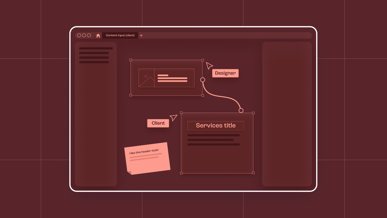
If you have worked with Figma before, you know it works well for organising files, documenting progress and presenting projects. But when you’re still in the process of gathering content from your clients, it can be a little overwhelming for non-Figma users. Insert FigJam! A collaboration tool where you can copy-paste your screens from Figma. The best part is that you can copy those updated screens from FigJam to Figma and all your components will stay linked, all your prototype links will still work and all your styles will be respected.
Your clients can add their own copy without being intimidated by the Figma interface and without the fear of messing up the layout of the design. FigJam can become your new client interface. You also don’t have to pay for an extra seat with the “open session” feature!
When you show your prototype to a client or user during a user test, you want to give them the full experience of what the design will look like and how it will behave. Instead of writing lines and lines of code, we can use interactions in Figma to achieve this.
Small details can make a prototype feel more realistic. We can use interactive components to switch between two variants; we use this for example to mimic working checkboxes. With the help of overflow scrolling we can give clients an even better feel of how their design will behave when it’s being used. You can scroll horizontally, vertically or in both directions through either the whole design or specific parts of it.
The drag and drop interaction is always a tricky one to demo without going into code. Lucky for us, Figma offers an option to fake it by using smart animate and choosing animate on drag. You need 3 screens for the 3 states of this drag interaction: one default state, one where the dragged item is hovering in the drop zone and then the final one where the item is dropped in the drop zone. You can add a hover effect on the drop zone and some shadow on the item for even more realism.
Since user testing is a big part of our DNA, we want to maximise its effectiveness by adding small yet powerful interactions such as the aforementioned hover state or checkboxes. With these interactive components, your component will behave closely to their intended final state and the user doesn’t have to rely so much on their imagination. As a designer it also makes your life easier: you simply add the interaction once in the master component and it will have that interaction on every instance of the component.
Speaking of creating realistic designs: to avoid having to detach components to fit realistic content don’t hesitate to use slot components. They help you to adapt components to a particular context, since you can replace the content locally with relevant info. That .slot component can even be replaced with any component in any other file using that same library. Perfect to use with interchangeable content, like accordions. It works like magic!
If you’ve followed us for a while, you might have heard the name FLOW floating around. FLOW is our internal library of building blocks that can be used to build any interface quickly. FLOW makes our design process in Figma more efficient, because it lets us focus on the functional aspects and visual designs. Less time is lost remaking buttons or tweaking the wireframe. Since the start of FLOW, it has grown and grown: we’re working on the third edition already. We added helpers, documentation components, interaction examples as well as marketing components you can use to build websites.
Craft CMS is flexible, user-friendly, and provides a range of powerful features. And that is why, most importantly, our clients love it too. ❤️
When creating a mobile app, an important decision we make early on is which framework to use as the foundation of the project. This involves choosing between developing a native app or a hybrid app. But what exactly is the difference?